The way your survey looks can determine how well it performs. The good news is that Qualtrics gives you the ability to customize the appearance of your survey in many different ways. Whether you use a custom-built theme built by our design experts, or you choose to individually customize specific survey elements yourself, Qualtrics gives you the ability to build visually appealing surveys like no other platform.
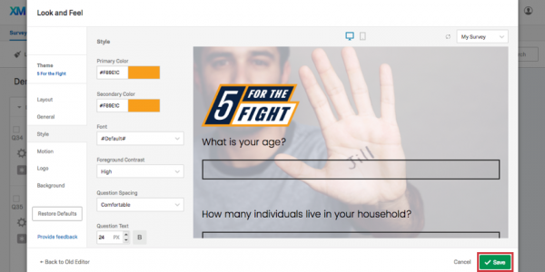
To access these customization options, go to the Look & Feel menu in the Survey tab.

Using the dropdown at the top, you can select from a list of Preset Qualtrics themes.

The Qualtrics themes are a preselected combination of features that can be edited under the General, Style, Motion, Logo, and Background sections of the new Look & Feel editor. Dynamic Themes are compatible with a series of different Layouts, which comprise of button styling, padding, and border radius. You may have only one dynamic theme listed here, which can be customized using the tabs listed.
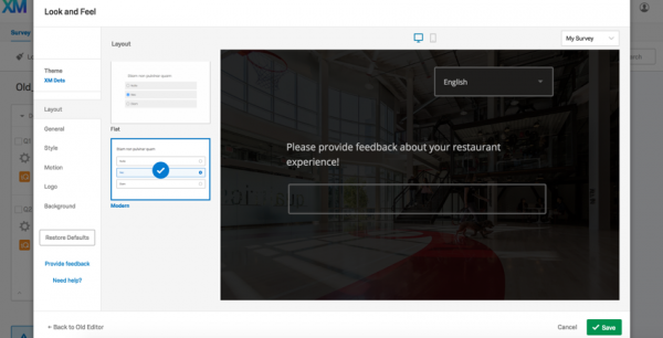
Whereas themes are brand-specific, and contain the Logo, Background, and Primary Color, layouts are a component of new Dynamic Themes that serve as a base template, controlling features such as button styling, padding, and border radius.
- Next Button Text: Change the default text of all the Next buttons in your survey.
- Previous Button Text: If you have Back buttons enabled, this will change the default text of all Back buttons in your survey.
- Progress Bar: Allow participants to see how far along they are in the survey. We generally recommend a progress bar over question numbers because it gives participants an idea of both how far they’ve come and how much further they have to go. NOTE: The Progress Bar counts every survey question in its calculation. If logic in your survey skips participants past a set of questions, their progress will jump accordingly.
- Progress Bar Position: Determine whether the progress bar is at the top or bottom of each survey page.
- Questions Per Page: Determine the default number of questions per page. This will not appear in the Look & Feel preview, but will work in the full Survey Preview.
- Header: Add content to the top of every page of your survey. Click Edit to open the Rich Content Editor and adjust things like font size, images, and text alignment.
- Footer: Add content to the bottom of every page of your survey. Click Edit to open the Rich Content Editor and adjust things like font size, images, and text alignment.

- Page Transition: Choose your preferred page load animation. You can see what each animation looks like by navigating between pages in the survey preview to the right.
- Autofocus: Sharpen the question the respondent is on, while blurring out other questions.
- Autoadvance on Questions: Let respondents advance past questions without scrolling. Instead, they will advance to the next question as soon as they select an answer.
- Autoadvance on Pages: Let respondents advance past pages without clicking a Next button. Instead, they will go to the next page as soon as they select an answer to the last question on the page. This option can be selected after you enable Autoadvance Questions. Qtip: Autoadvance on Pages will introduce the back button into your survey even if it isn’t enabled in your Survey Experience settings.

- Logo Image: See a preview of your chosen logo. Click Change Image to choose a new logo, or get rid of the logo entirely by clicking Remove Image.
- Style: Decide whether the logo is Floating (default, allowing the logo to appear as is) or Banner (putting the logo on a banner background, often in the Primary Color).
- Placement: Decide where on the top of the page the logo should be positioned.
- Max Height: Determine the height of the logo. The width will adjust automatically.
- Mobile Scaling: Determine how you want the logo size to adjust relative to the default size. If your logo is large, it might be better to adjust this percentage lower. This setting affects both Desktop and Mobile views.

If you want your background to be a solid color, change the background type to Color. Then click the color block below to select a color from a hex code palette.
If you’d like to use an image as your background, change your background type to Photo. Click Change Image to add a background image. Note that whatever you choose will adjust to the screen’s size, so it’s best to choose a very large, high-resolution image.

You can also select an Overlay Color, covering your background with a layer of black (Dark) or white (Light). The Overlay Opacity allows you to decide how thick this overlay is.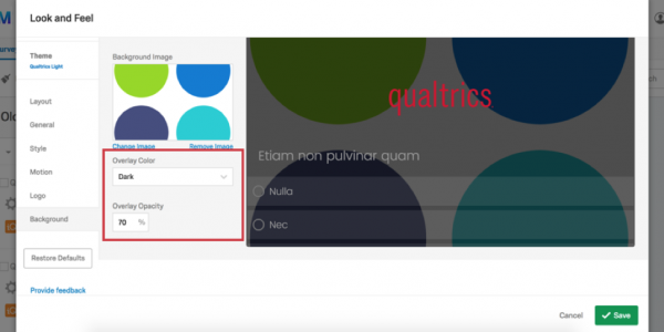
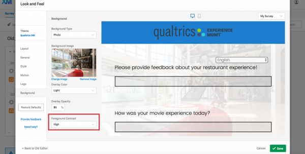
Regardless of whether your background is set to color or image, you can set a Foreground Contrast. To determine this, we select a gray scale color that adheres to a proper contrast ratio of 4.5, which is WCAG compliant. To increase the contrast between the text and background, change this to Medium or High. High is always white or black. We also take into account the background image and overlay color/opacity when determining the proper foreground color.
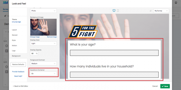
You can also set a Questions Container. This option puts whitespace around your questions. This can often be preferable for themes that have detailed photo backgrounds, and where the text is still hard to read even with all contrast options set to high.
To save your changes, click Save on the lower-right of the screen.
To erase the changes you’ve made and revert back to the default settings for your chosen theme, click Restore Defaults. This works regardless of whether you made edits yesterday or in the same browsing session.

Toggle the icons at the top of the preview to see either a Desktop (left icon) or Mobile (right icon) view. This is especially helpful when choosing the size of your elements, to ensure they are readable and aesthetically pleasing on mobile.
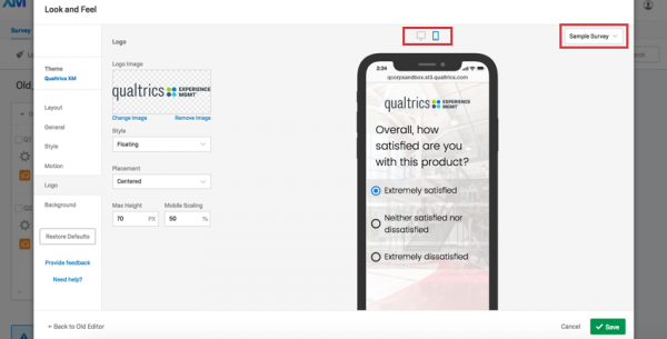
In the upper-right dropdown, you can also choose between previewing your own survey and a sample survey. The sample survey has complex logic and other features designed to help you make sure you’re using the optimal theme for even the most rigorous survey design. Whichever survey you selected will be remembered each time you enter the Look & Feel edito